Instagram icons
 What the designer of the old Instagram icon thinks of the new one
By Pete Pachal From Mashable
Plenty of people are complaining about the new Instagram logo and want it changed back to the “original.” But wrap your mind around this little-known fact: The old Instagram logo — the square instant camera with the tiny rainbow — was actually not the original.
Before Instagram had the iconic logo we’re all familiar with (and are now wistfully remembering), the app actually brandished a design that looked a lot more like a real camera, designed by CEO Kevin Systrom himself. Systrom said in 2011 that he changed the logo because it “had nothing to do with Instagram,” and enlisted the help of one of the app’s users, designer and photographer Cole Rise, to design a new one back in the fall of 2010.
But that’s not the whole story. Mashable caught up with Rise in the wake of Instagram’s big change. Far from being bitter over seeing his work cast aside, Rise thinks the new icon is great, which probably isn’t surprising since he’s a friend and former colleague of both of Instagram’s founders.
“I’m super psyched on the new one,” Rise says. “I love the minimalism. Regardless of the colors behind it, the white shape — the actual bones of the new symbol itself — is beautiful, and I think that can persist over time.”
Rise says he’s also a friend of Robert Padbury, one of the architects of the new icon and one of the designers behind other big tech design changes, including Uber’s revamp from earlier this year and Apple’s huge shift to flat design in iOS 7.
“If anyone is going to update it, I trust that guy,” Rise says. “He’s done so many great icons. I’m glad to see him riff on it.”
Genesis of an icon
Rise’s old design came about when the app was virtually brand-new. Systrom and his co-founder, Mike Krieger, had just formally launched Instagram in the App Store after a months-long beta. Rise was an active beta user (in fact, the app’s Rise filter is named after him) and had become friends the the pair.
“I was just helping out a couple of buddies of mine who were launching a new photo app,” recounts Rise. “I think they’re the smartest people in the world. I was really excited about [Instagram] as a photographer.”
When the app was about to launch in October 2010, Apple wanted to put Instagram in the store’s “featured” section. But there was a problem: The original logo — which Systrom designed himself and was basically a stylized rendering of a real Polaroid OneStep instant camera — was using a trademarked design, and it had to go. So Systrom called Rise since he had recently created a camera-like app icon he liked.
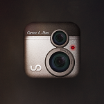
“He said, ‘We can’t use our current icon because of trademark stuff, so I was wondering if we could buy an old icon you had done.’ He was referring to an icon I had designed that was inspired by a Bell & Howell camera, an 8mm camera from the ’50s.”
Rise went to work, and in about 45 minutes, the Instagram logo was born.
That icon was spoken for, however. Rise, who has created his own apps over the years, had designed the icon for his startup, but he told Systrom he might be able to rework the design into something for Instagram. Systrom gave him an hour.
Rise went to work, and in about 45 minutes, the Instagram logo was born.
“I made this brand-new imaginary camera that was Bell & Howell-inspired, with elements of the old icon so it was an easier transition,” he says.
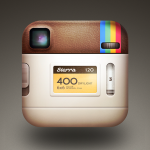
The logo Rise submitted that day was a less-polished version of the logo we’ve been tapping on for years. He continued to iterate with Systrom’s guidance, adding details like adding an overhead lighting effect, and detailing the room reflected in the camera lens (you can see a window if you look closely). The final version of Rise’s icon shipped with Instagram 2.0 in 2011.
“We got really nerdy on it,” Rise says. “As a joke, we designed the back of the icon. We shipped it off to Facebook when they got acquired, it was a nice handoff.”
Although Rise likes the new logo, there’s been plenty of panic on Twitter about the change, particularly with the choice of colors and the gradient. He chalks the reaction up to the standard hand-wringing whenever a major product or service changes.
“It’s kind of like the Uber redesign — people freaked out, and now it’s totally fine. Change can be hard, and people will have to adjust to it, but I think people will love the new stuff once they get used to it on their home screens.”
Images:
Mashable Composite. Steven Xiong /EyeEm/ Getty Images and Instagram
2016%2f06%2f30%2feb%2f201503270cheadshot_20.820a0.f61ddBy Pete Pachal
May 11, 2016
The “back” of the Instagram icon. Image: Cole Rise
Instagram 1.0 vs. 2.0 Image: Instagram
Rise’s “Uooo” icon that served as inspiration for the Instagram icon. Image: Cole Rise
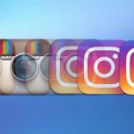
Instagram’s old app icons (above) vs. the new ones. Image: Instagram
The original Instagram icon Image: Instagram
Image: Mashable Composite. Steven Xiong /EyeEm/ Getty Images and Instagram
For more on this story go to: http://mashable.com/2016/05/11/instagram-old-icon-designer/?utm_source=feedburner&utm_medium=feed&utm_campaign=Feed%3A+Mashable+%28Mashable%29#TIPmkA.MCOqk