The myth of ugly design
 By Andrew McDermott From Web Design Depot
Have you heard the dangerous lie that’s going around? It goes like this: “Design isn’tthat important. I have an ugly site and it sells like crazy. It outperforms the ‘well designed’ site I used to have.”
This horrible myth is perpetuated by marketers.
They tell us…
- Ugly sites outperform beautiful ones
- To make our sites uglier
- Pretty pages suck
- Ugly products sell better
But, is it true?
We know design matters. We know it’s a deep and fundamental part of communication. But we’re often unsure about how to communicate that.
This horrible myth is perpetuated by marketers
We’re left feeling angry and frustrated. Let’s be honest. As far as marketing is concerned, most executives are focused on one thing: Money. At the end of the day executives want to know—will it attract more leads, customers and sales? To them, everything else is secondary. It’s a common assumption made by many executives, marketers, business owners, and entrepreneurs. Some of these professionals will even pay for an amazing design, but they’ll do it because they feel they have to. That it’s something the marketplaceexpects them to do.
This leads to an unremarkable disaster. They create a design so they can meet the demands of the marketplace. They’re not interested in optimizing their design. They don’t want to improve the UX, follow usability best practices, or A/B split test their UI. They just want to get it done and over with. So they can focus their time and attention on something else.
They prefer a lie over the truth…because it’s easier. Because it’s faster and more convenient. But how do we know this is actually a lie? For all we know, an ugly design could be the right move, right?
Not a chance.
We know this is wrong, even when we can’t prove it. Here’s the thing though. We won’t get the support we need at work if we can’t prove it. So how do you go about proving this?
You work backwards, looking at how people think. Okay…
What do people really think about beautiful design?
- Food manufacturers used beautiful designs to create iconic brands. These designs helped them sell more products at a time when competition was brutal and fierce. Case in point? Coca-Cola. Coca-Cola has always had stiff competition, but it’s their iconic bottle design that helped them come out on top.
- People buy more from design-driven companies. The good news? Research showsDesign-driven companies outperform the S&P by 228% over 10 years. The bad news is that out of a pool of 75 publicly traded U.S. companies, only 15 meet the criteria to be considered design-driven
- People form first impressions about websites, people, etc. in 1/10th of a second or 50 milliseconds. This first impression is based entirely on visuals and it utilizes emotion. These snap judgments bypass logical reasoning completely and once made, are incredibly difficult to shake.
- Research shows physically attractive people are viewed as more sociable, dominant, sexually warm, mentally healthy, and intelligent.
These examples show that people rely on design to form first impressions about the people, groups and organizations they’re interacting with.
Just one problem: We still haven’t dealt with the biggest lie of all…Most people carry this lie around with them in their subconscious. They use it as a measuring stick in their day-to-day interactions. That’s a bad thing because it leads to continual disappointment. What lie am I talking about?
Design = Beauty
Here’s how Oxford dictionary defines design: Purpose, planning or intention that exists or is thought to exist behind an action, fact or material object.
There wasn’t a single word about beauty. Not a single word about appeal, attractiveness or looks.
Amazing designs rely on two important ingredients. Your design is actually a presentation vehicle. It’s a communication tool customers use to evaluate and interact. Your presentation is actually a mix of tangible and intangible factors working together.
- Tangible factors like typography, color, layout, quality, imagery, etc. Things users can see.
- Intangible factors like clarity, ease-of-use, trust, values, credibility, uniqueness, risk, the UX, etc.
Here’s the thing about these tangible and intangible presentation factors. Your users expect them to match. Users expect your tangible and intangible presentation factors to align. When they do, they feel comfortable, safe and relaxed. It’s easy for them to work with your UI. Your design is appealing, they’re drawn to your product or service etc.
When your tangible and intangible presentation factors match, user resistance goes down. When there’s a mismatch user resistance goes up. That’s the problem. Marketers and managers are ignoring these presentation factors.
Managers ignore design, then blame designers when things go wrong
Managers ignore design, then blame designers when things go wrong.
Unsophisticated organizations assume presentation and design is all about “looks.” But they ignore the backend work that goes into creating a purpose driven design.
This leads to three common presentation mistakes.
- A tangible/intangible conflict
- Design expectations that miss the mark
- Beauty without benefit
1. A TANGIBLE/INTANGIBLE CONFLICT
Have an ugly tub? Bath Magic wants you to make it beautiful with their re-glazing products. On their website they focus on the downsides of an unsightly tub.
From their perspective ugly = bad. So why does their website look like this?
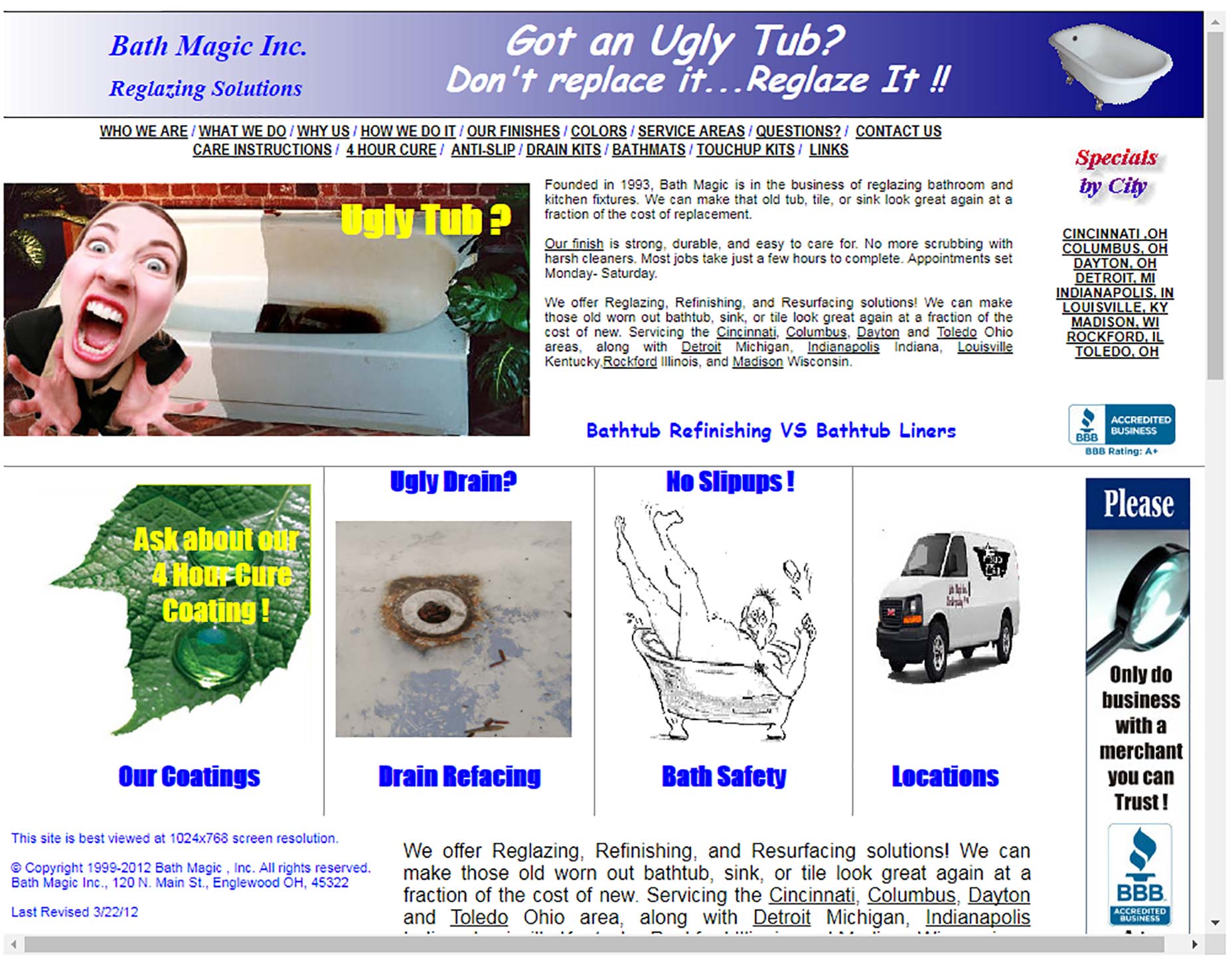
This is an intangible/tangible conflict. It’s the elephant in the room, the unspoken assumption almost every user will make. You make bathtubs beautiful, why is your website so ugly?
This tangible/intangible conflict increases user resistance. This inconsistency means people are far less likely to buy, read, invest, etc.
2. DESIGN EXPECTATIONS THAT MISS THE MARK
Users expect artists to understand design. Users expect an artist’s website to be beautiful, creative and appealing. Most designers would agree. The Visual Arts League decided against creating a beautiful website.
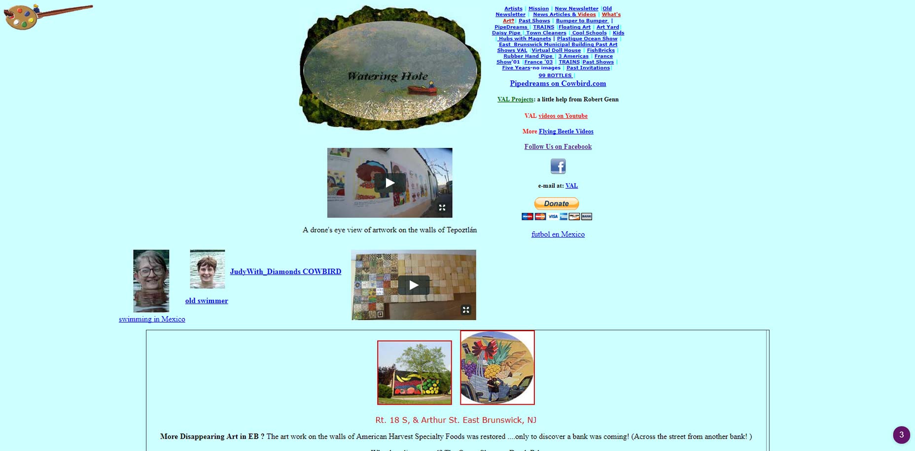
Users who are unfamiliar with their organization find the experience jarring. Aren’t artists supposed to create beautiful, functional things? The site is ugly and it’s difficult to use.
3. BEAUTY WITHOUT BENEFIT
Take a look at this micro site for Toyota. It’s clear from the design that someone spent a lot of time on this.
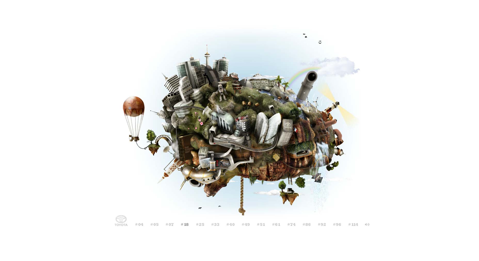
From an artistic standpoint it’s appealing. What’s not clear is what users are supposed to do. Click on any of the details on the screen and a portion of the site animates, but that’s pretty much it.
As far as designs go, it’s difficult to use. There’s no obvious purpose, plan or intention behind it, it’s an art piece.
As far as designs go, these aren’t the only mistakes. This also doesn’t solve our problem. The vast majority of ugly designs are dramatic failures.
WHAT ABOUT THE UGLY SUCCESS STORIES?
Marketers reference a few ugly websites citing these as proof that “ugly is best.” They swear by these sites and they tell everyone that ugly is more profitable.
CRAIGSLIST
Launched in 1995, Craigslist is viewed by many as the poster boy of the “ugly is best” campaigns. A 2016 estimate listed their annual revenue at 694 million.
DRUDGE REPORT
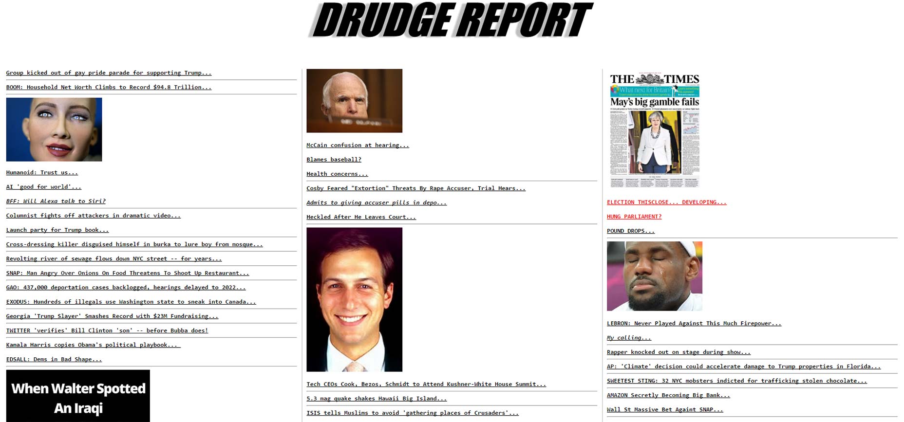
The Drudge report is a one page political site with no onsite “content.” The site is heavy on headlines (links) with a sprinkling of images throughout. The site was also launched in 1995.
Basecamp’s Jason Fried has argued that Drudge Report is one of the best designed sites on the web.
LINGSCARS.COM
Our worst offender comes from Ling Valentine, owner of Lingscars.com, a UK based car dealership. Ling wanted publicity for her website but she didn’t have a sizeable marketing budget. So, she built her business using social media, publicity stunts and a website that looks like this:
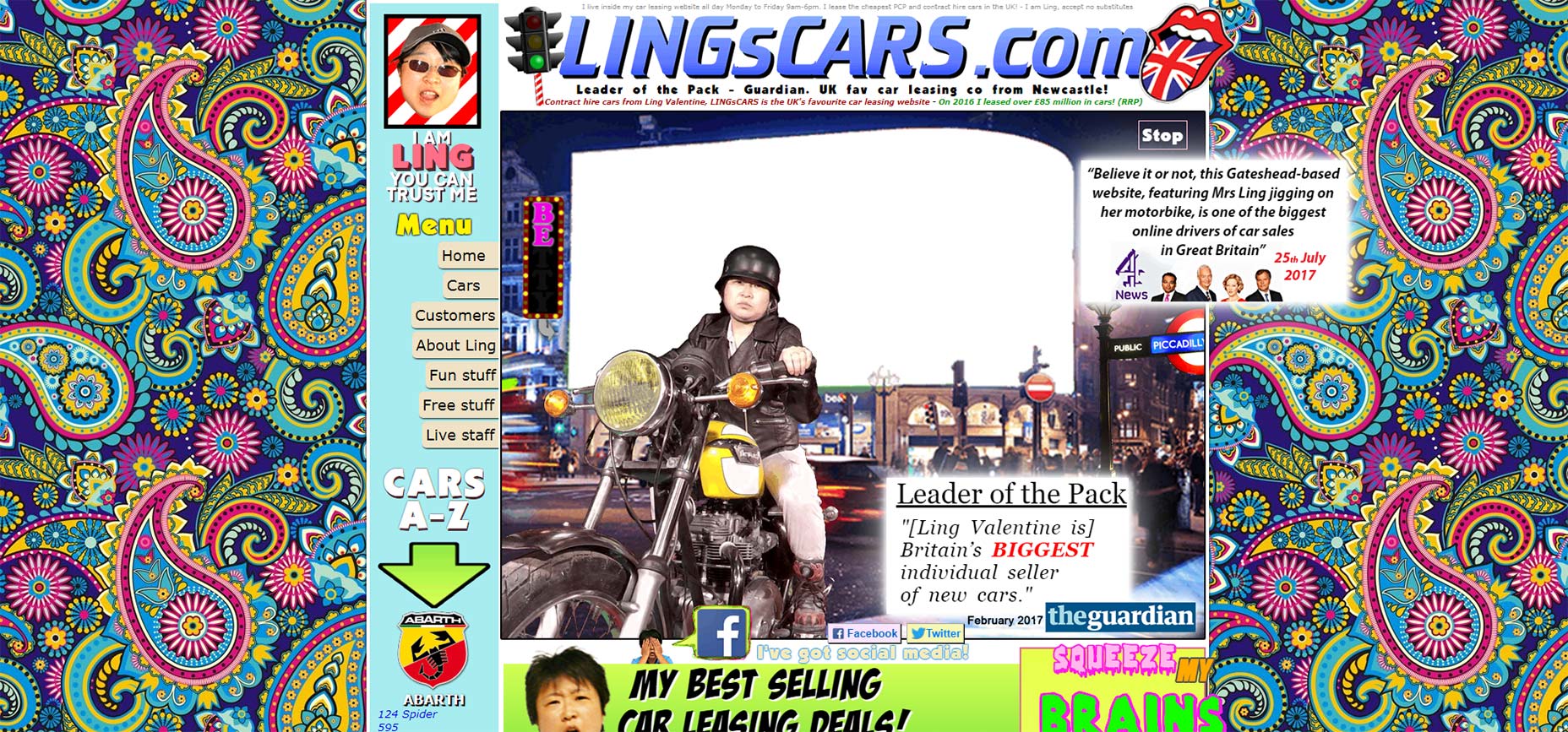
Lingscars was hailed as the biggest individual seller of cars, selling £85 million in 2016.
These designs are terrible, what gives?
These websites are successful in spite of their terrible design, not because of it. They’re the exception, not the rule.
Craigslist and Drudge Report are layovers from 20 years ago.
These sites built an audience around their design. They chose to leave things as they were and their audience stayed with them. Lingscars.com uses her terrible website as a prop. It’s intentional but it’s also unsustainable.
How do I know?
Look at Ling’s website when she started. Her first website is actually an improvement on what she has now.
The ugly websites I’ve mentioned (and the ones I haven’t) use tangible and intangible presentation factors to attract users, customers and sales. Ling’s publicity stunts work in automotive sales. Would they work in the high fashion, cosmetics or tech industries?
Not a chance.
Because the user expectations, the intangible aspects present in their industry, won’t allow it.
WHEN IT COMES TO DESIGN, BEAUTY IS THE DEFAULT
Beauty is a subset of design. But design is focused around purpose, on planning. That purpose is determined by the tangible and intangible presentation factors around you.
Beauty is a subset of design
In the right industry, an ugly and difficult design can work.
But ugly and difficult work in spite of the poor design, not because of it. Because great designs consistently outperform bad ones.
WHAT MAKES A DESIGN SUCCESSFUL?
- It has a purpose and a plan
- It’s crafted around and serves your users
- It aligns with tangible /intangible presentation factors
- It’s iterative, continuing to evolve around users
- It isn’t a cute, clever or trendy art piece
If you’re a sophisticated designer you know this. Your co-workers don’t. Which is exactly why marketers, managers and co-workers spread the lie that ugly designs are best.
Does this mean a design should always be beautiful?
It means design should have a purpose.
Anything made by people first requires design. Beauty is in the eye of the beholder. It’s subjective and often difficult to quantify. Amazing designs on the other hand, are clear, compelling and precise—which incidentally, is beautiful.
YOUR DESIGNS SHOULD BE PURPOSEFUL AND CLEAR
Ugly and difficult isn’t best. You don’t have to be blindsided by the lie. Marketers may not understand why good design matters, but you do.
It’s up to you to show them.
This irritating deception gets lobbed at designers repeatedly and most of the time, designers are completely unprepared. You’re ready. You understand the tangible and intangible elements of design. Share it with your team. Give them the education and resources they need to combat the lie and you’ll find it stops mattering.
BY ANDREW MCDERMOTT
![]()
For more on this story go to: https://www.webdesignerdepot.com/2017/09/the-myth-of-ugly-design/