Pantone swatches designs
 This designer uses Pantone swatches in the coolest way
BY MARTHA TESEMA From Mashable
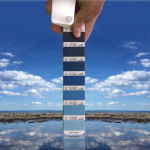
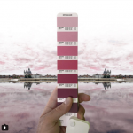
If you’ve only gathered Pantone swatches to test out paints, you might want to take things up a notch and learn a thing or two about the versatility of the swatch from Andrea Antoni.
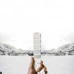
The Italian designer’s Instagram is filled with beautiful photographs in which he cleverly uses Pantone swatches to match the colors in his images, creating a soothing and visually appealing collection of awesome photos.
“Many years ago, I would regularly publish the Pantone color of the day that matched the sky above my house,” Antoni told Creators.
“As a graphic designer, I’ve always loved the Pantone fan decks, although more for their joyfulness and color than for their intended purpose,” he explained. “So it happened one day that I took a particularly colorful picture and tried to combine it with the related Pantone color.”
Today, his Instagram feed filled with beautiful scenes from Italy and their perfect Pantone counterparts.
Antoni edits some of the images to “reflect the way [he] sees the world,” he explained to Creators. And what a world it is.
IMAGES:
[H/T Paste Magazine]


stailuan Madesimo
stailuan
stailuan Venice, Italy
stailuan Marina Nova
stailuan Marina Julia
stailuan Spiaggia – Grado
For more on this story go to: http://mashable.com/2017/05/20/pantone-swatch-photographs/?utm_campaign=Feed%3A+Mashable+%28Mashable%29&utm_cid=Mash-Prod-RSS-Feedburner-All-Partial&utm_source=feedburner&utm_medium=feed#M_7iZZFlZmqZ