Modern poster designs
 10 of the Best Modern Poster Designs to Inspire Creativity
By Andrei Tiburca From Web Design Ledger
Posters offer a diverse canvas for graphic designers, and some of the very best are not only beautifully designed but also inspiring and thought-provoking. There are hundreds of stunning poster designs that are instantly eye-catching, but we’ve narrowed this list down to a few of the most intriguing examples from the current decade. Whether you prefer to be bold or understated, you’re certain to find something here that will get your creative juices flowing.
1. Stranger Things Poster
“Stranger Things” became a hugely popular show on Netflix thanks in part to the captivating poster that promoted it. Designer Kyle Lambert was able to expertly capture many of the most important elements and characters in a way that draws the viewer in without providing any spoilers.
One of the most brilliant things about this poster is that it provides a throwback to the 1980s style, which is the perfect complement for the feel of the show. Combine that with extremely accurate renderings of the actors and the overall emotive quality of the piece, and it’s no wonder that viewers flocked to Netflix.
2. Maze Runner: Scorch Trials Poster
Movie poster designers have the enormous task of making something stand out in a very crowded environment. After all, posters are everywhere at your local movie theater, and that can easily make them blend together unless a unique feature grabs your attention. “Maze Runner: Scorch Trials” quickly amassed blockbuster status in 2015, and this visually appealing poster almost certainly helped make that happen.
The use of negative space works extremely well here, and it also contrasts perfectly with the test tube shape in the middle. These subtle clues to the plot points may not even be picked up by most casual viewers, but they showcase a lot of skill on the designer’s part.
3. Silver Surfer Poster
Silver surfer Poster


If imitation is truly the sincerest form of flattery, then all of the designers who influenced Retro Heroes creator Grégoire Guillemin should definitely feel flattered. For example, the classic “Metropolis” poster was clearly the inspiration for this retro rendering of comic book character Silver Surfer. The poster draws you in because of the similarities, but it’s also set apart by the font choice and bold red color that frames two sides of the image.
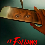
4. It Follows Poster
“It Follows” surprised box office prediction experts by not only receiving rave critical reviews but also becoming a huge indie hit that brought in more than six times its miniscule budget. The strength of what started as a limited release is mostly attributed to word of mouth praise, but the film’s movie posters also deserve a lot of credit.
Graphic designer Akiko Stehrenberger draws viewers in instantly with the compelling usage of eyes staring straight at you. The foggy blank space is an intriguing addition because it makes the identity of the “It” a huge mystery, and this results in the viewer imagining the most terrible things possible.
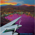
5. Air New Zealand Poster
Retro designs have been popular for several years, but this usually means creating a new poster that has a retro styled image. Air New Zealand decided to go back to the past in 2016 for the 75th anniversary by rereleasing old posters instead that help showcase the history of aviation. This particular design features great usage of Technicolor for a vibrant appearance that makes flying look beautiful and glamorous.
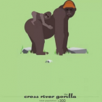
6. Cross River Gorilla Poster(Endangered Species Line)
There are more than 16,000 animals that are currently threatened with extinction, and the Cross River Gorilla is high on the priority list. With a population of approximately only 300 left on Earth, it’s important to conserve their habitat and to raise awareness of their plight.
Artist Sean Duggan decided to utilize a minimal design with a retro feel to put people face to face with an image of two of these gorillas. The decision to have a mother and baby gorilla looking straight at the viewer makes it hard not to feel sympathetic for their plight.
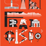
7. San Francisco Tourism Poster
A tourism poster needs to depict at least one aspect of the area in question, and it should also intrigue and excite people. The Discover San Francisco poster may seem a bit cluttered at first, but it’s actually quite brilliant how the designer turned each letter into a recognizable part of the city’s charm and daily life. From the deeply slanted hilly roads to the intersection of Haight and Ashbury, all of the most tourism friendly places are represented.
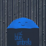
8. The Blue Umbrella Poster
“The Blue Umbrella” is a short film from Pixar that was released with “Monsters University.” To promote their animated piece, Pixar produced this mesmerizing poster that easily captures attention. The umbrella itself is very kid-friendly with its happy expression. However, it’s the lines of the rain drops that draw us in every time we look at this poster. The implied motion is brilliantly executed, as is the juxtaposition between the color and typical mood of the word blue with the contented expression of the umbrella.
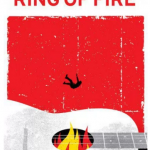
9. The Foundation of Arts Ring of Fire Exhibit Poster
This poster design wins big points for being fun, using a bold color to stand out and showcasing an extremely literal interpretation of its subject matter. As a poster for a music retrospective exhibition for Johnny Cash, it makes perfect sense to refer to one of his most famous songs. Bringing it to life by having a figure appear to be literally falling into a burning ring of fire was brilliant enough, but having that ring be the hole in Cash’s guitar really boosts the impact of this piece. Adding in the vintage feel and the eye-catching red background provided the proverbial icing on the cake.
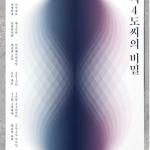
10. The Secret of 4°C Poster
Posters can be designed to sell something, to raise awareness, to motivate or to explore a graphic designer’s personal interests. The particular piece is educational and visually appealing. At a first glance, you might not realize that the image in the middle of the poster is a dewdrop.
Water achieves its heaviest state when it reaches 4° Celsius, and artist Jongwon Won used the gradient scale in an attempt to depict and explore the many stages that water goes through just before or after this specific temperature. Even without knowing this explanation, the design, use of color and well-placed white space is captivating.
There are, of course, thousands of other designs we could have chosen, but these 10 are a nice representative sample of some of the best work that has been produced during this decade. There are clearly some common themes between most of these pieces, and that’s a reflection on modern trends. Allow these to inspire you, and perhaps you’ll be the one to spark the next massive trend in poster graphic design.
For more on this story go to: https://webdesignledger.com/10-best-modern-poster-designs-inspire-creativity/